STATE FARM
Team Lead MyAccounts/Senior UX Architect
State Farm is one of the largest U.S. insurance providers, supporting millions of customers across digital channels.
Over nearly nine years, I helped evolve the user experience across StateFarm.com and the State Farm mobile app within the UX Digital organization. I served as UX Team Lead / Architect across multiple product areas, including:
Mobile App experience
My Accounts
Homepage & landing pages
Community Offers
Conversational experiences (Chat, Voice) and emerging tech
RESPONSIBILITIES
Strategy, User Research, Competitive Analysis, Workflows, Heuristic Evaluations, Wireframes and Prototypes, Creative Direction, Leadership Presentations
MyAccounts Redesign
My Accounts is a high-traffic, high-stakes experience where customers manage policies, billing, and service requests, so friction quickly turns into support calls and churn. A UX assessment (heuristic review, journey evaluation, and stakeholder input) revealed gaps in information architecture, content clarity, and navigation that were limiting findability and task completion. The challenge: the journey had been redesigned recently, and the product team was understandably cautious about investing in another overhaul. My role was to translate the findings into a clear, low-risk plan, aligning stakeholders on what to change, why it mattered, and how to phase the work for measurable improvement.
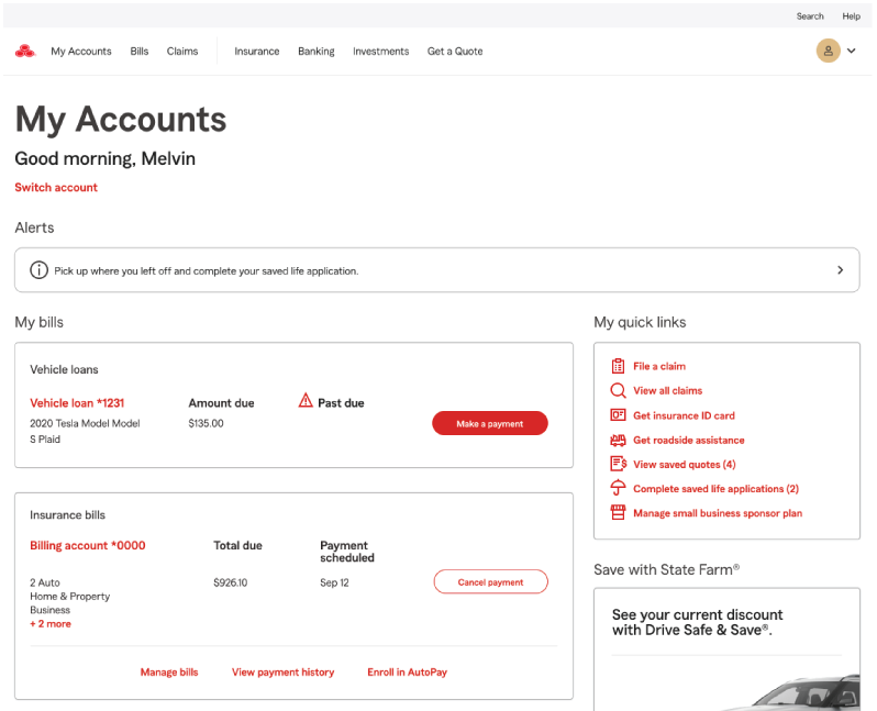
Old MyAccounts
UX Strategy

Challenges and opportunities
When I joined the My Accounts UX team, we were in the middle of a comprehensive evaluation of the authenticated service journey. We focused on the top 10 self-service tasks customers performed most often, along with support effectiveness and alignment to enterprise design standards. We closed the effort by presenting a prioritized set of findings and recommendations to our Product Owners.
Turning recommendations into a plan
We aligned the work to core enterprise objectives: increasing self-service, improving omnichannel consistency, and enabling personalization. Meeting those goals required changes to the underlying information architecture. The current page structure was static, difficult to scale, and slow to evolve. I recommended a shift toward a modular page framework that would allow iterative enhancements over time and support continuous improvement.

Rebuilding collaboration with a One Team workflow
With strategy in place, I introduced a refreshed workflow grounded in a “One Team” approach to repair a strained Product–UX relationship. My priority as the UX lead was to rebuild trust and show that UX could deliver measurable value without slowing delivery. We increased transparency through shared working sessions, clearer decision points, and continuous stakeholder feedback throughout the design lifecycle. The result was stronger alignment, faster decisions, and shared ownership of outcomes.
De-risking delivery through incremental change
While many ideas were well received, a large redesign raised concerns given an already packed roadmap. To address this, I proposed a parallel track that delivered smaller, incremental improvements while the broader redesign strategy matured. This approach reduced risk, protected roadmap commitments, and demonstrated progress early, helping us earn sustained buy-in from product partners.
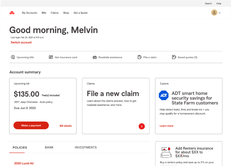
Solutions in action
Over 18 months, we incrementally improved the My Accounts experience by establishing a modular information architecture built on independent content blocks. This approach improved flexibility, reduced dependency between sections, and made it easier to evolve the experience over time. The structure allowed page sections to be assembled dynamically, updated without disrupting the full layout, and iterated on in smaller releases. Partnering closely with Product and Engineering, we moved from discovery and validation into design and implementation, using iterative delivery to incorporate feedback and adapt to evolving priorities while keeping the overall experience cohesive and scalable.
Architecture & Content Strategy
To streamline the experience, we started with high-confidence improvements that would reduce noise without changing core functionality. The My Accounts landing page had accumulated redundant links, repeated content, and competing sections. We defined a removal and consolidation strategy, implemented changes in a controlled release, and validated impact through usability feedback and behavioral signals (for example, findability, time to task, and reduced mis-clicks).
Within the broader State Farm service journey, My Accounts functioned as a central hub connecting multiple independent applications. Even with an enterprise design system in place, inconsistencies in patterns, terminology, and content hierarchy surfaced as customers moved between flows. To improve cohesion, we partnered closely with adjacent product teams to align navigation, content standards, and interaction patterns across pages and platforms.

Design
In partnership with Product and Engineering, we translated the modular architecture into a phased design plan by identifying priority page sections to redesign, validate, and ship. Each section was intentionally scoped to fit within the existing platform constraints while still improving clarity, hierarchy, and task flow.
For each release, we moved through a consistent cycle: UX reviews, usability validation, iteration, and delivery-ready specs. Over time, we applied the same approach across the broader My Accounts experience, creating a more cohesive and predictable journey from entry to completion.


Continuous Enhancements
Early results were strong, and we achieved many of the outcomes we set out to deliver. We also treated the redesign as a living product, not a one-time release. The modular content-block architecture made it easier to evaluate performance, refine content, and iterate on individual sections without reworking the entire page.
As customer needs, channels, and expectations evolved, we continued to reassess priorities and improve the experience through incremental updates, keeping the journey relevant and scalable over time.